• Physically on
  • Bakshibazar, Puran Dhaka
    Dhaka 1211

Personal Branding - GFX

Year

2025

Role in project

Logo & Brand identity

Clients

ABOUT THE Organization

GFX Manjur is a dedicated BRAND DESIGNER (Studio in future) with a passion for creating timeless and distinctive brand identities.

He believe that a brand’s design should go beyond merely reflecting the client’s desires—it must resonate.

GFX Manjur is actually a person…


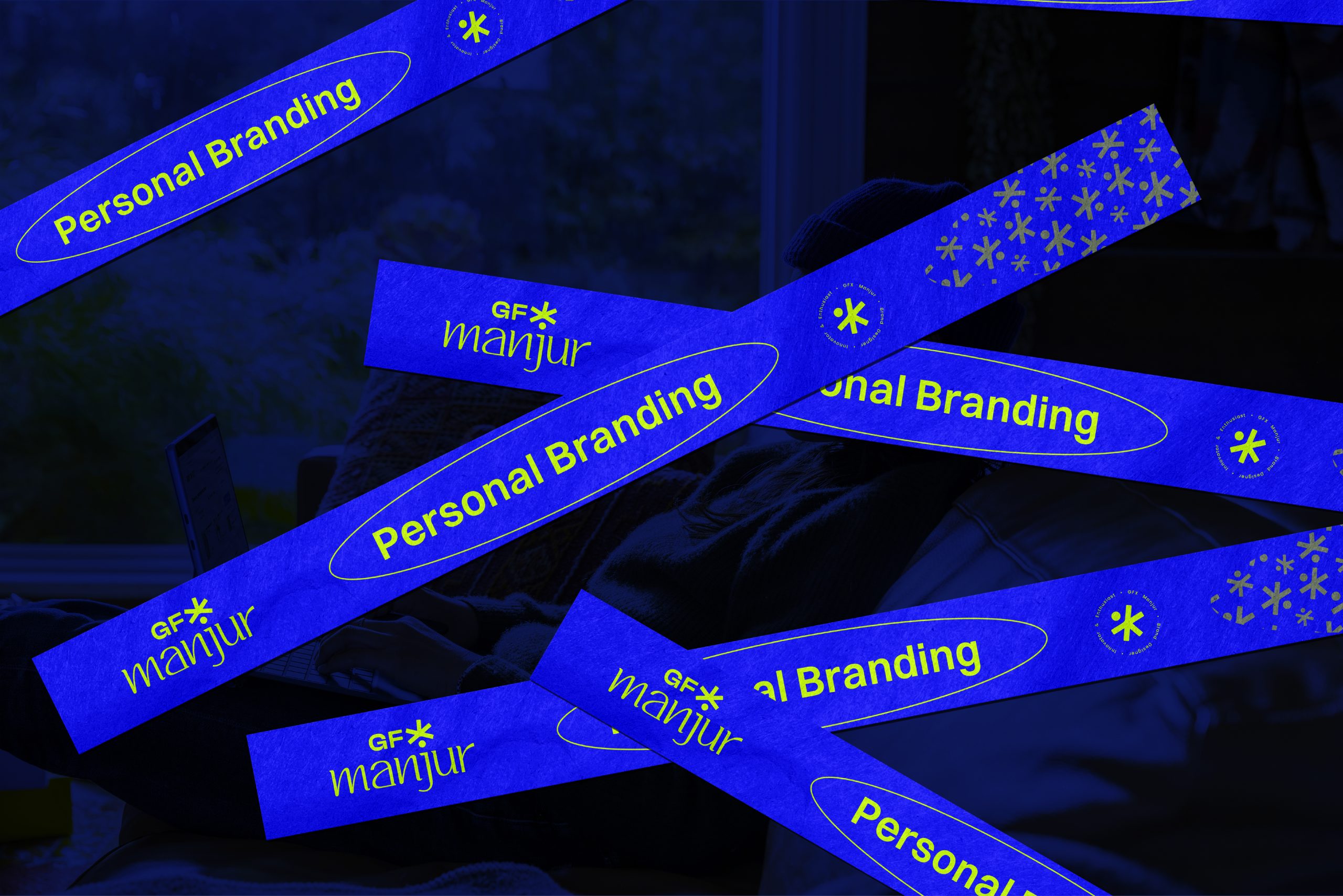
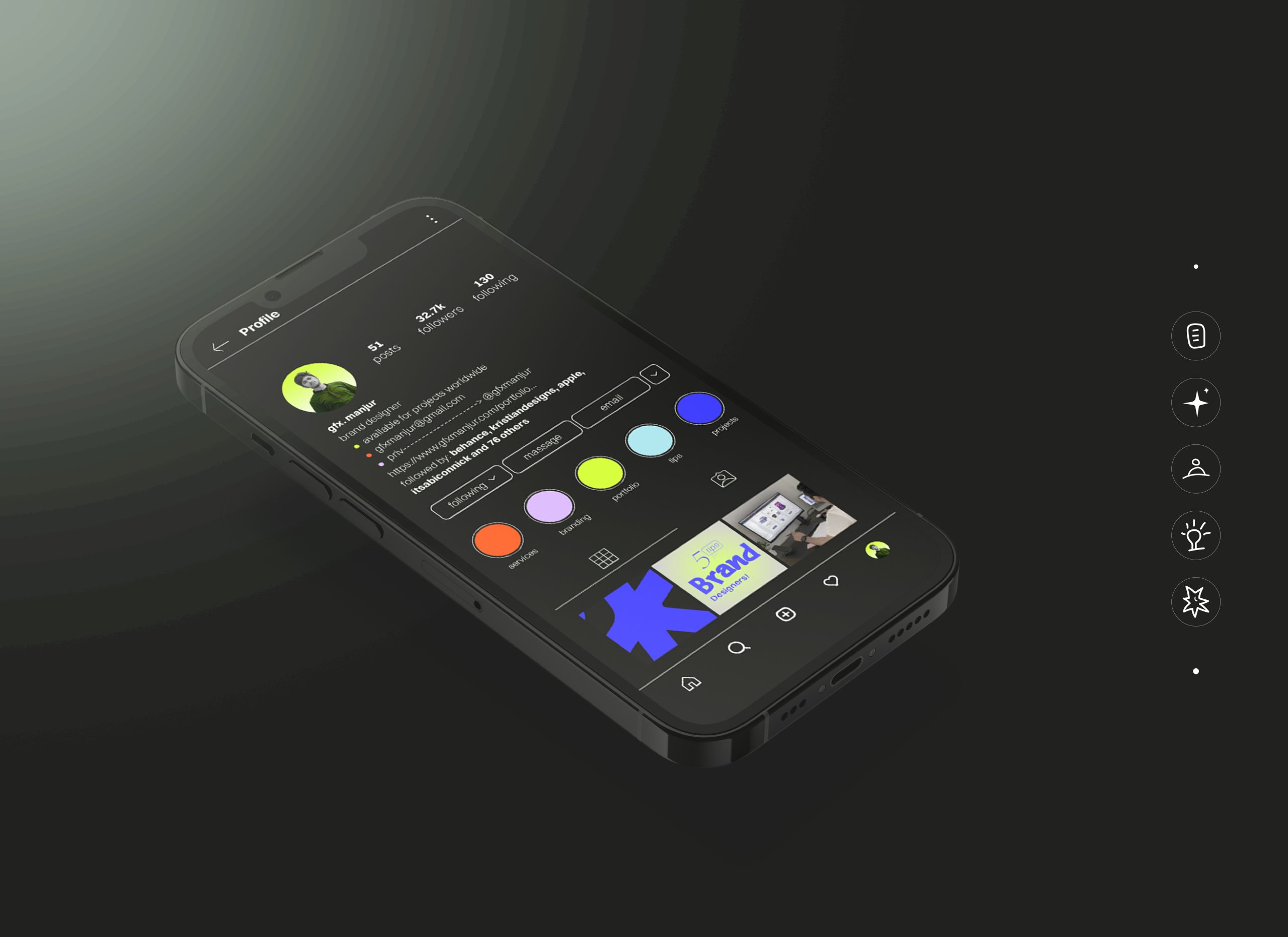
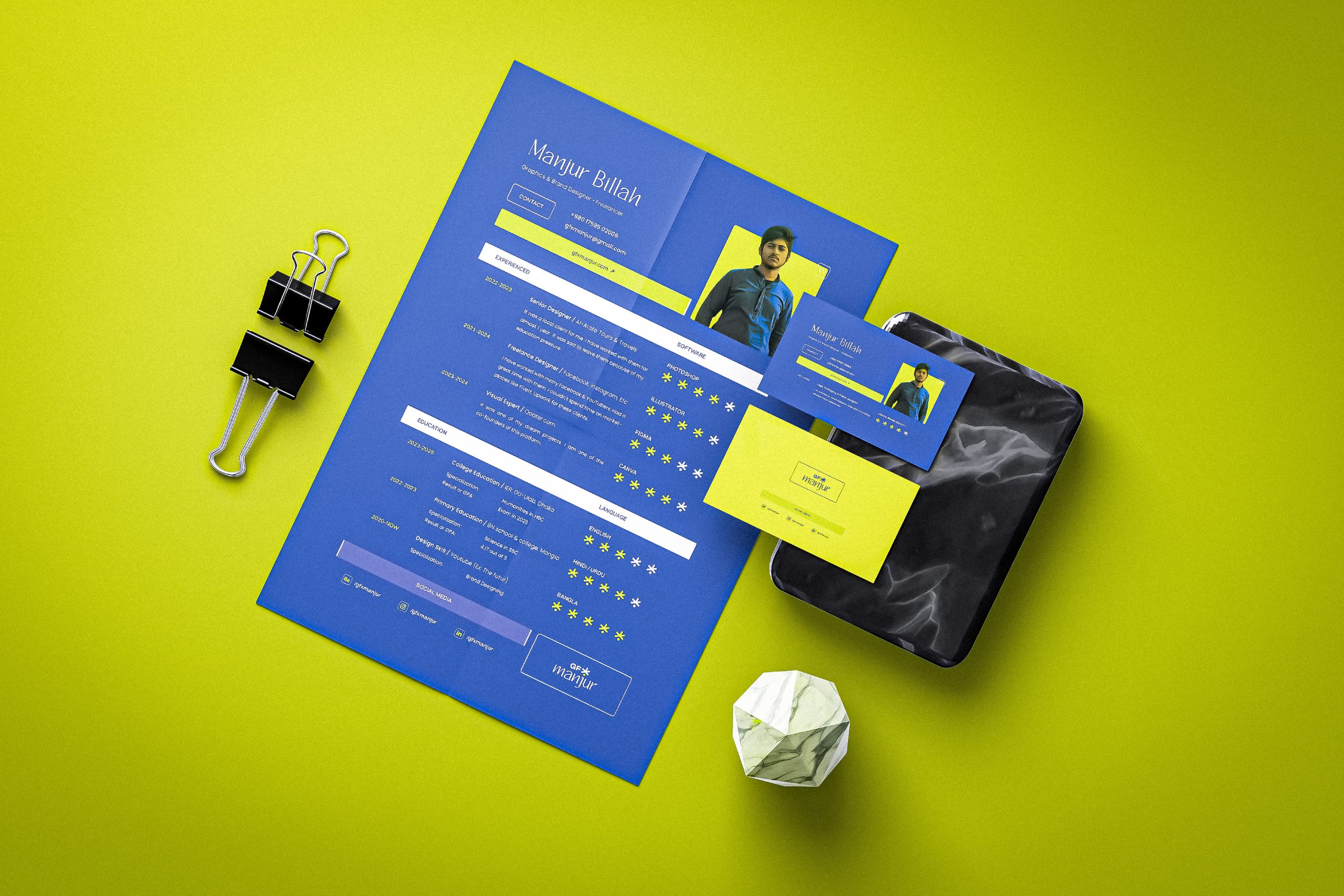
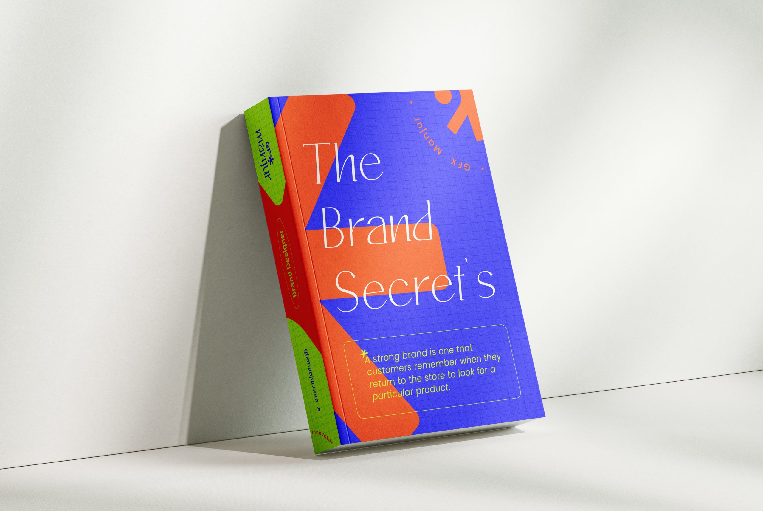
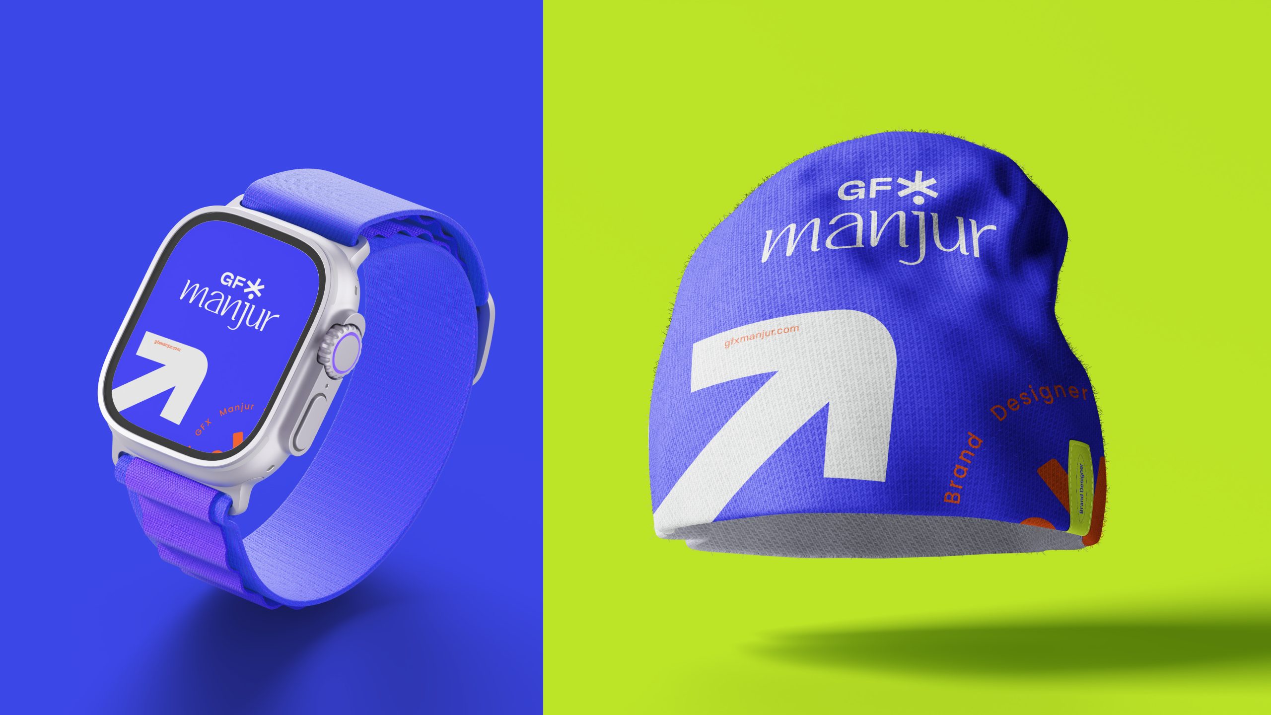
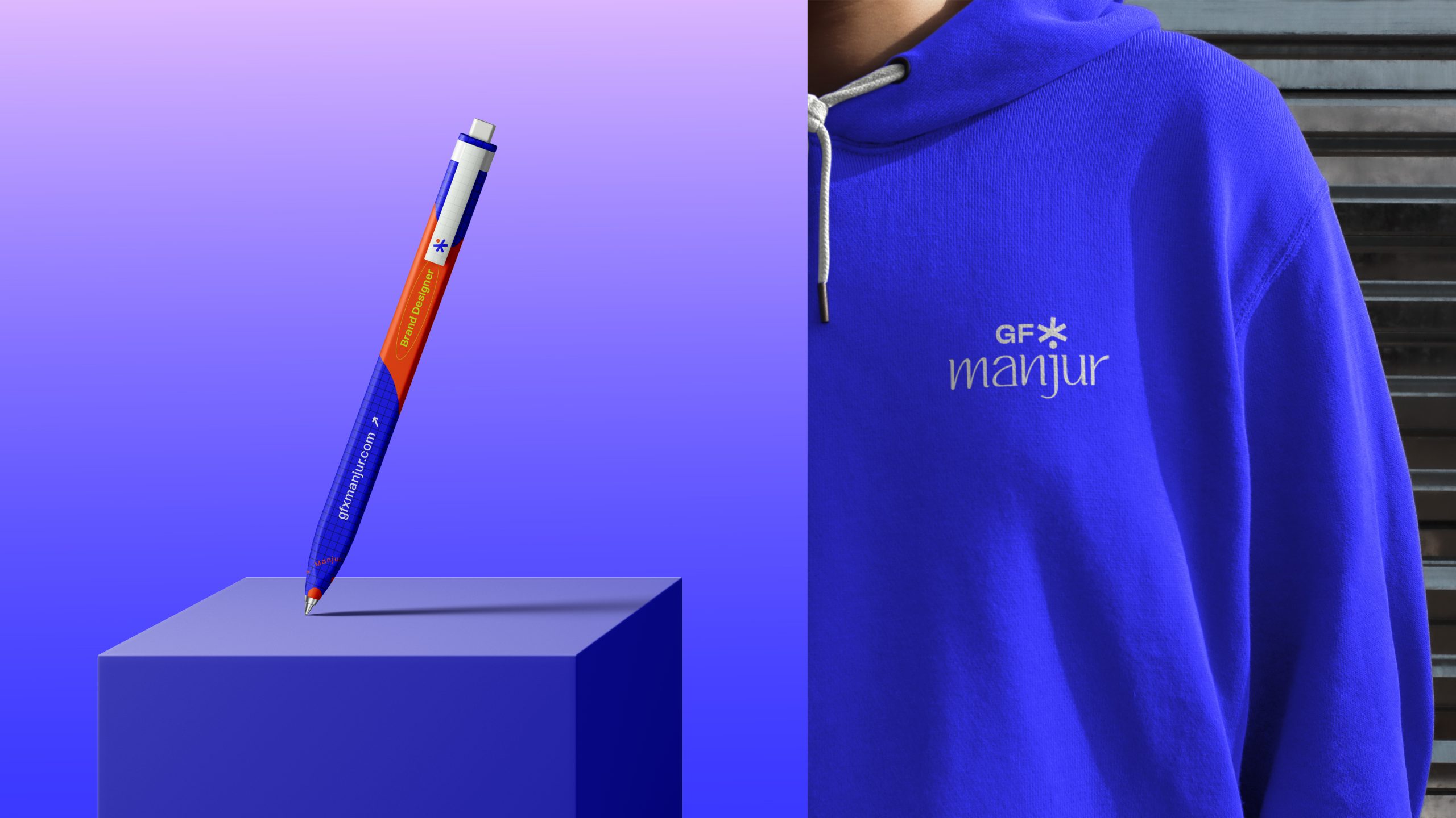
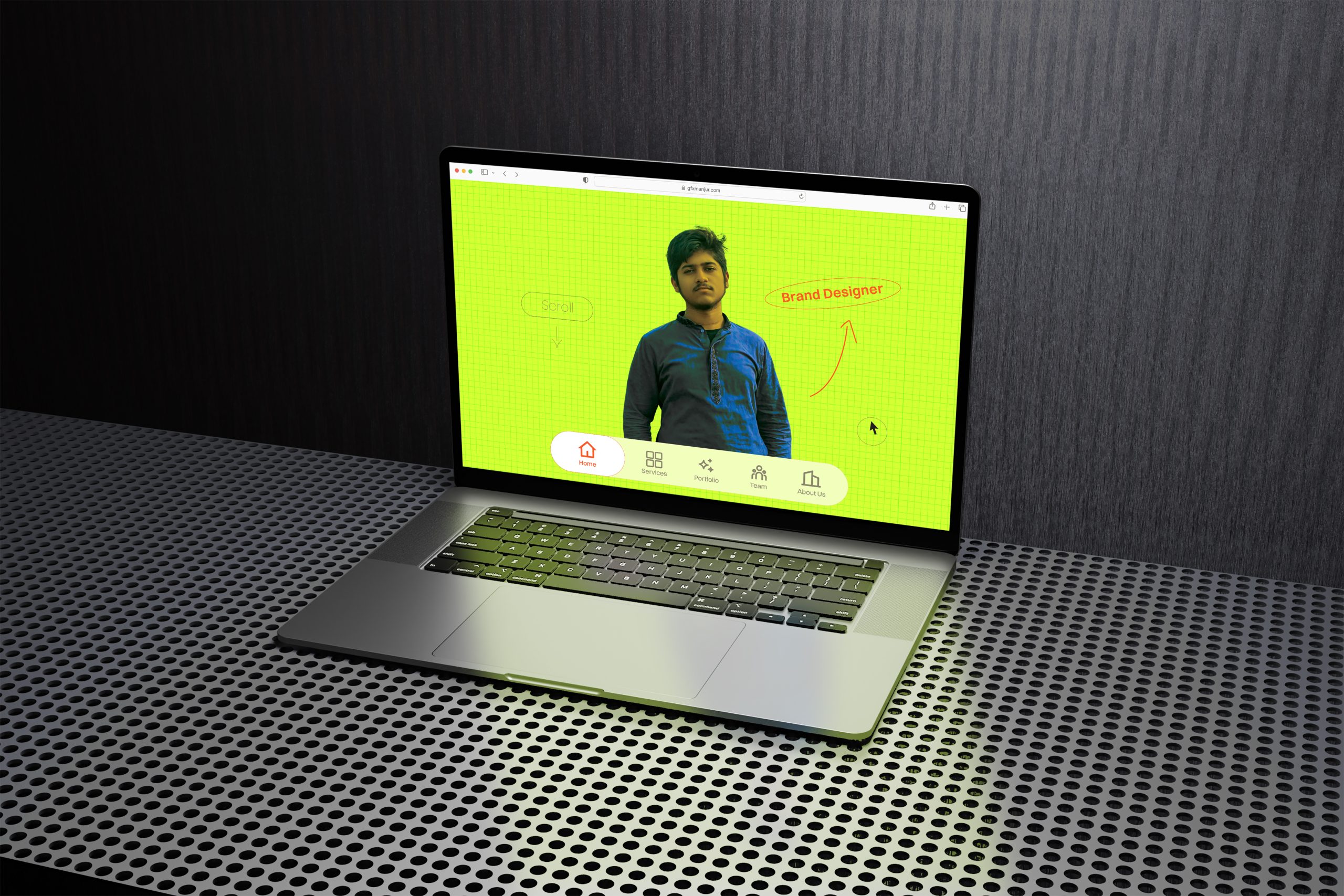
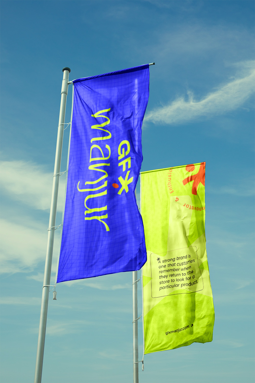
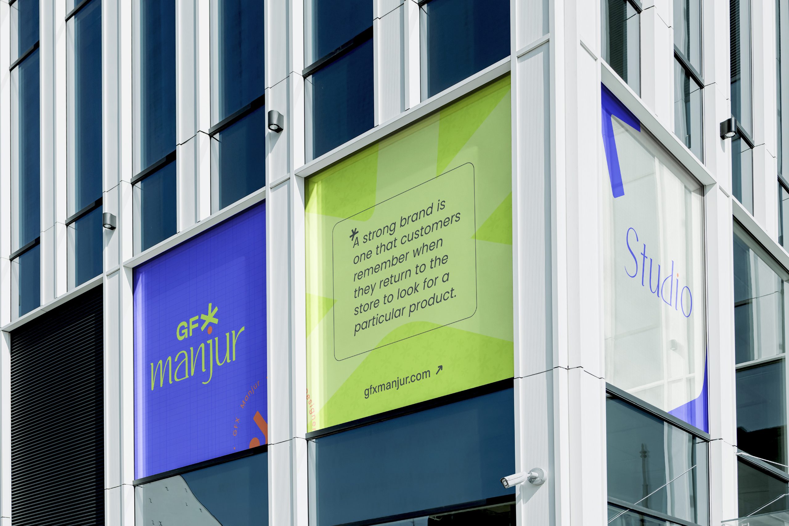
MD Manjur BIllah. He is a creative logo & brand identity designer with more than 4 years and has a record of 100+ happy clients. Now he is planning to create a personal brand for himself, and he has a vision to be transformed into a studio/agency very soon. For now, he will practice this branding on his personal brand and try to establish his face in this competitive market, and then you will start his agency, which will be aligned with his personal brand absolutely.
 
 
  //
 
 
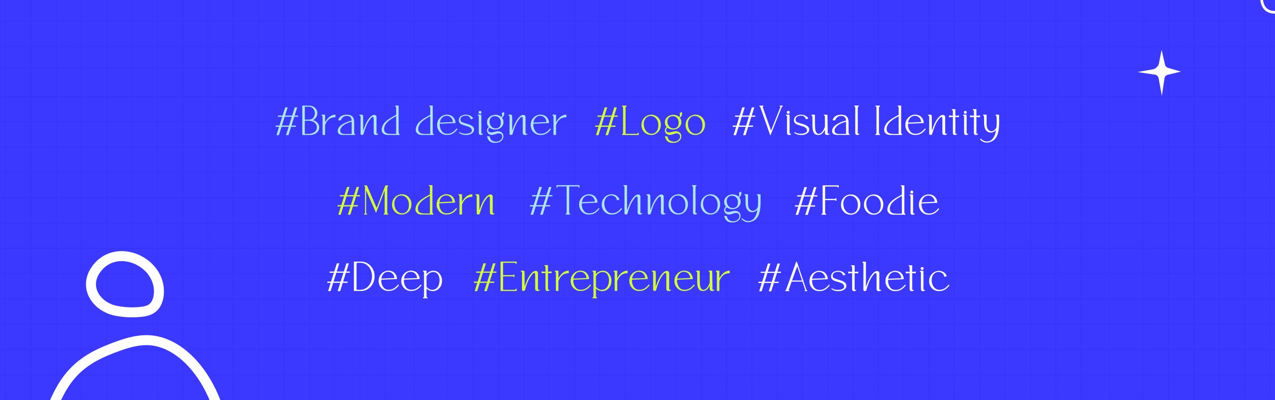
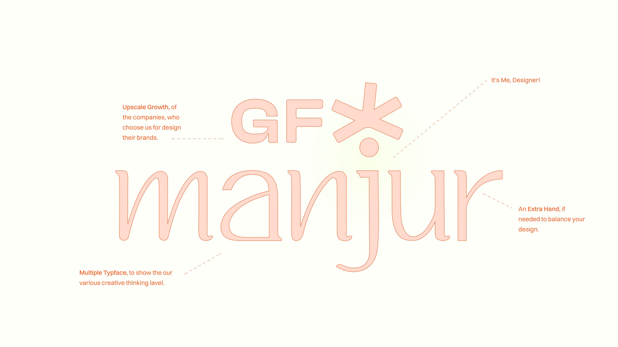
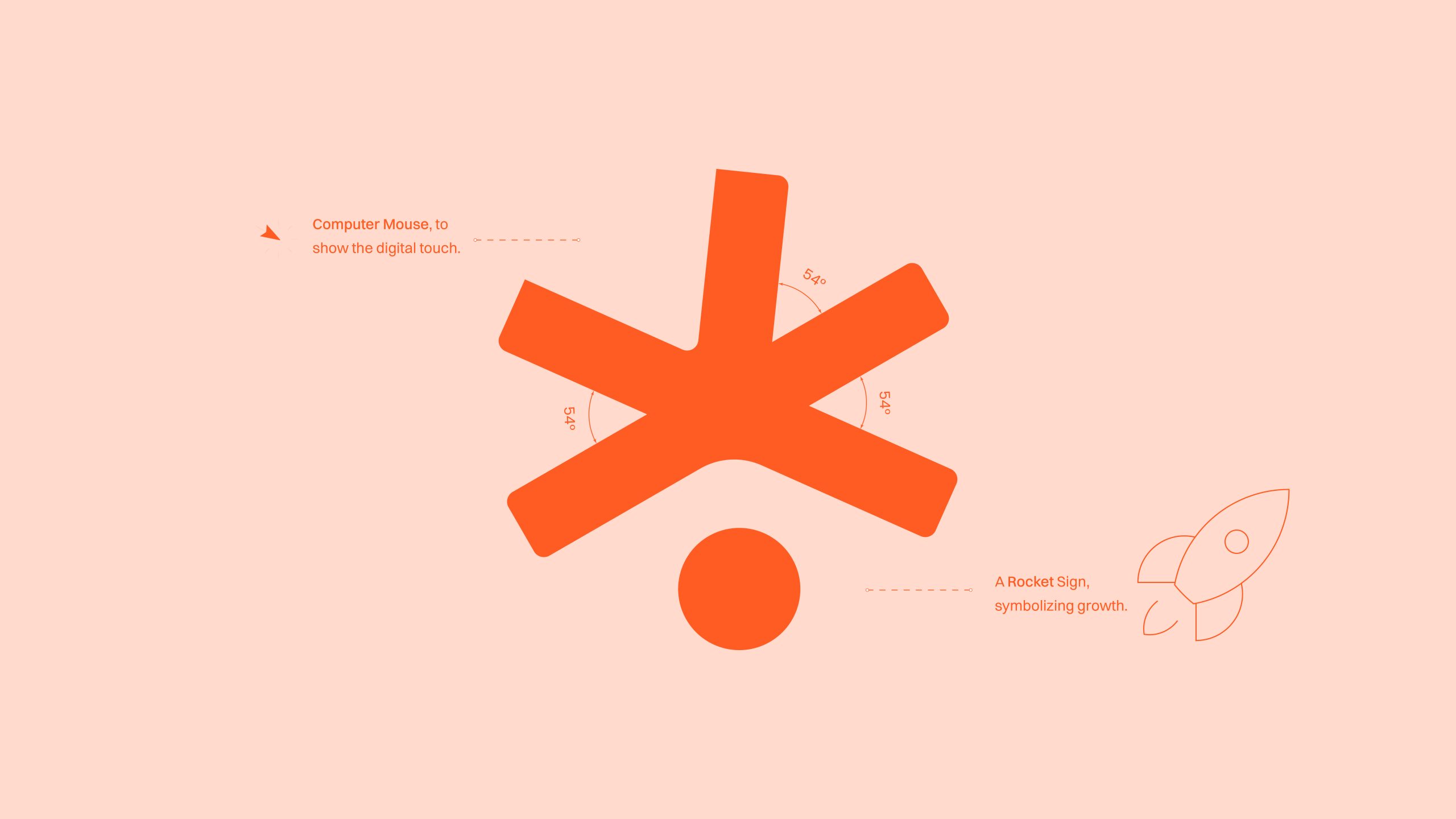
He also got some pillars to set himself. That can combine with his personality and the profession both at the same time. That was the guide to our design process as well.

Responsibilities

Follow the recommendations, AFter that sparks on your creativity and go beyond

  • Use ‘Dreamer’ for title typeface
  • High-contrast palette; stick to ‘Less is More’.
  • Could be a ‘STAR’ logo concept

Insights

30

Days Project Duration

0

Revisions in logo

THe brand values We followed also

TIMELESSNESS SIMPLICITY INTEGRITY & TRUST IMPACTFUL BALANCE INNOVATION UNIQUENESS CLIENT-SATISFACTION CREATIVITY ENTHUSIASM
For the typography we choose exactly that could shows his creative sparks. Three set of fonts was chosen by their readability and balance. For title we took Dreamer for its exact depth in balance.
When we had to set the colors for the brand we thought about the famous quote ‘Less is More‘ that actually helps us for making contrast between our color set.
It was a real challenge to create something creative for a creative! That’s where came to multiple concepts that make sense for their uniqueness. Then we have actually landed on that exact mark which is a ‘STAR’. It also has its own meaning in every angles.
We put balance in every aspect. Then we started thinking for clever meanings into it.
For this brand, they wanted some pattern ideas to especially use on digital medias.Thats why we did complicated patterns that can add extra depth on digital images mostly.
Manjur wants some social media refreshment must. He was struggling to maintain consistency by striking a balance between friendliness. Though he wanted to target Europe and America, but as now his audience was from Asia, and that was the real struggle for him. We also had to create some email signature for him.
 
SEE LIVE ↗
 
He also had set his INSTAGRAM realigned by his new branding. SEE LIVE ↗
As if now he is gonna practice this personal branding with his personal profile. That will need some social media templates and stories. He will, as a person, try to guide new freelancers and designers in the sector, and definitely, as a profession expert, he will use these templates to post that attracts them.
Working with his color palette more and making his icon in action, it absolutely making stunning itself that was our absolute goal as well.
It was his quote—We design in mind your customers
after refining it we put a work ‘BRAND’ before the customer and makes it cross my putting a line on it. That was making a visual language showing the exact vision for the line.
 
Then we created a custom illustrated background and combined both for use in cover photos.
Though his vision was to create a transform it as a studio, he needed some stationary as well for manage his team in future and his official documents. for as if now he just wanted a CV.
It was really a strategic move for his brand. He gives us an absolute standing idea that has to create a premium card. It was different from others and its competitor agencies to grow in this competitive market. 
 
It’s an exclusive item , which is why it has its own distribution system and positioning. The card’s value is in its flexibility. It’s not one fixed discount; it’s a personalized offer for various brand identity services. This card is their way of partnering with deserving entrepreneurs. It might offer even free services that actually deserve it.
 
Experimenting with different accessories gives exact potential for this identity. The client was instantly in love with the pendrive design.
Our client’s vision was simple, he wanted to create a community that would be dedicated to exactly what his profession is not going to explore on video editing and thumbnail designing, or, extra, these types of services. He wants to create a separate niche, something that will give only this service to his clients with perfection, and educate newcomers as well.

REAL LIFE ACCESSORIES

 
The client especially mentioned us for some real-life accessories like a cap hat, and hoodies to use for personal and his team in the future.
 
He wanted these things to be very simple and creative, which might be different from his local uses, but will shine on digital media when you show them on videos and posts, etc.
Right now, what he is going to transform into reality very soon is a Hoodie. He is going to use them in his personal life, and that will be branding on his YouTube videos when he records them
For the design of applications we keeps it simple and easy to use. Rightnow it on the 1.0 version live which is very soon gonna update to this one – https://gfxmanjur.com/