• Physically on
  • Bakshibazar, Puran Dhaka
    Dhaka 1211

Tomo 友 - Branding

Year

2025

Role in project

Logo & Brand identity

Clients

Tomo (友)

ABOUT THE Organization

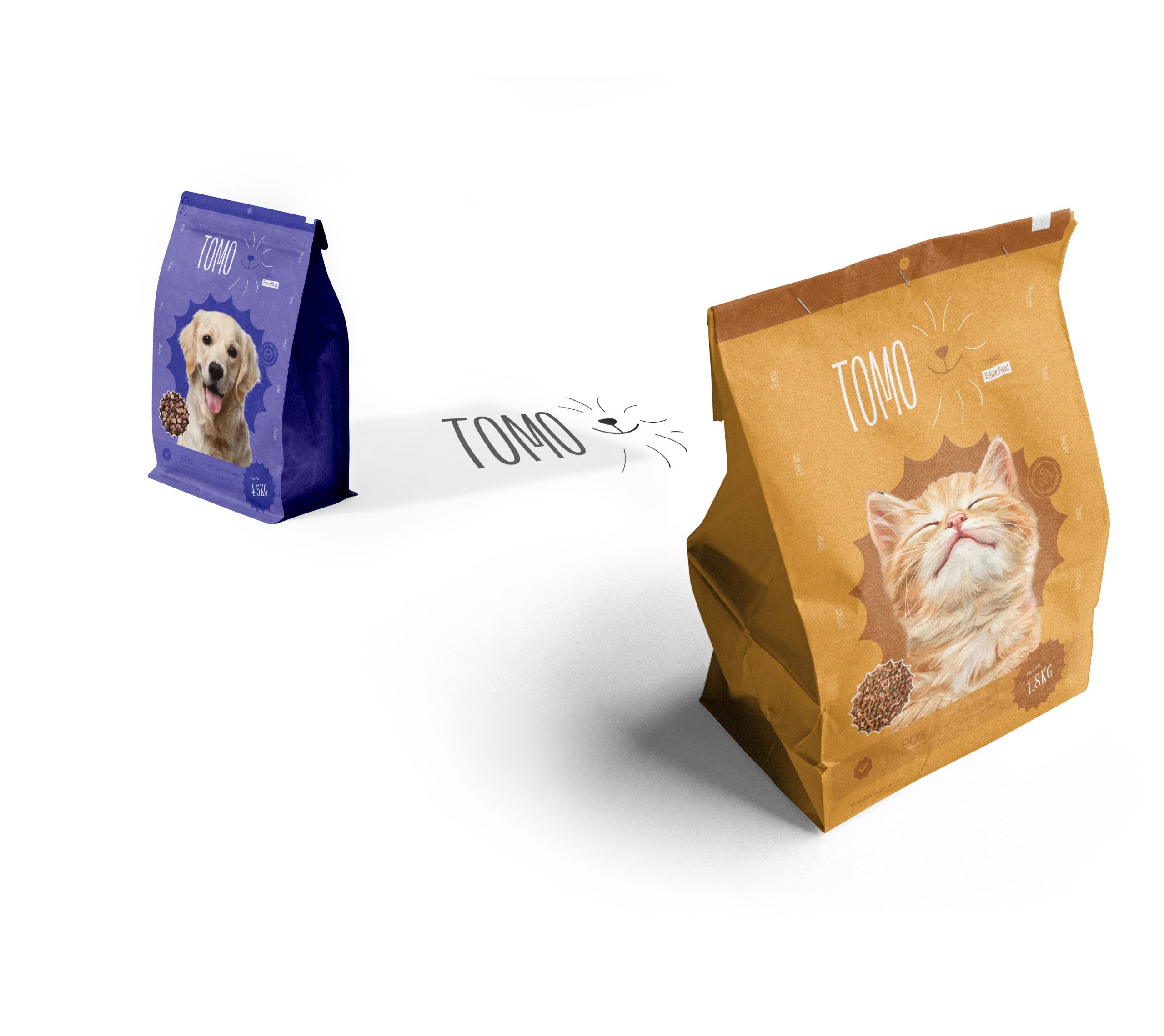
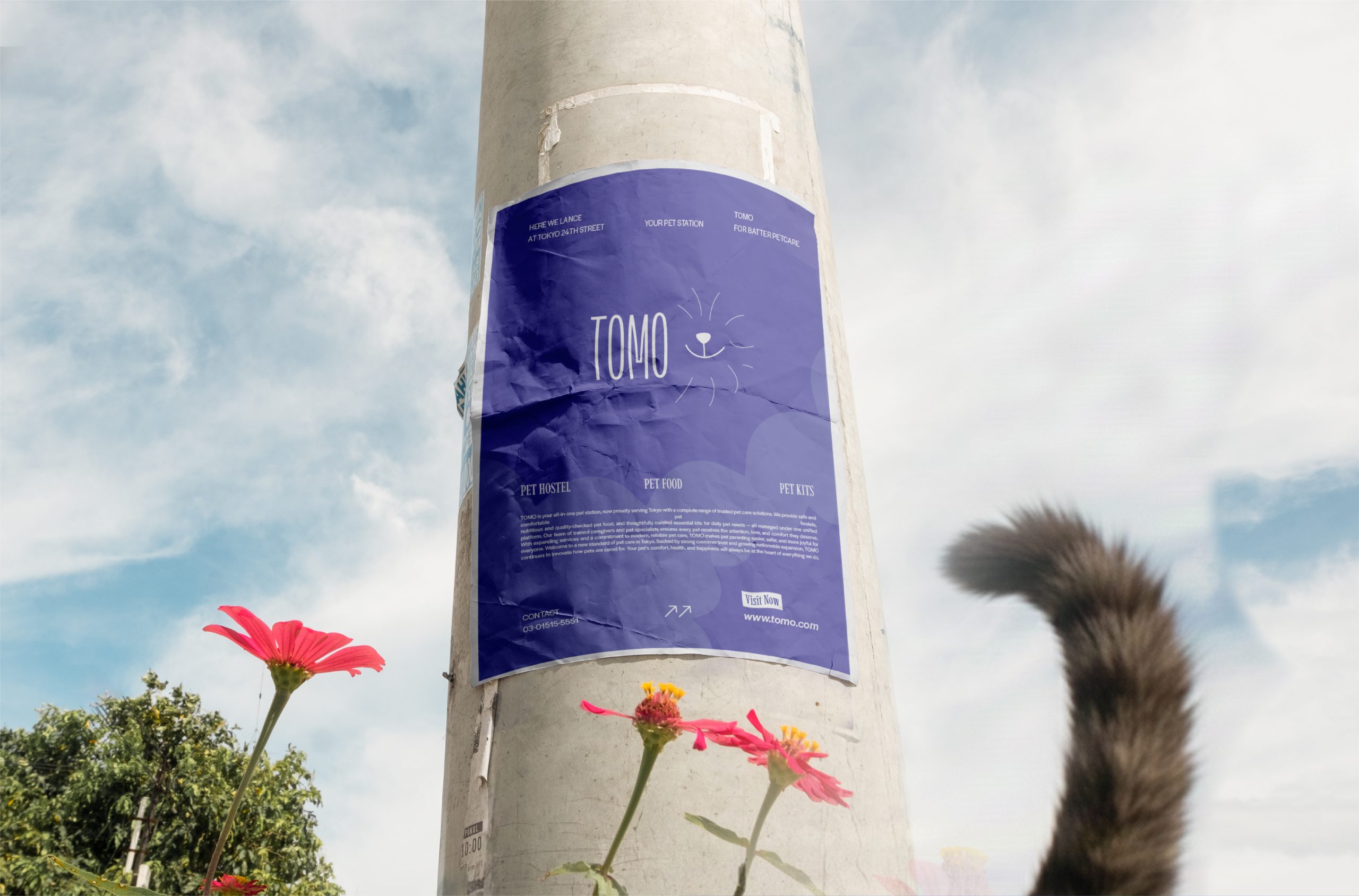
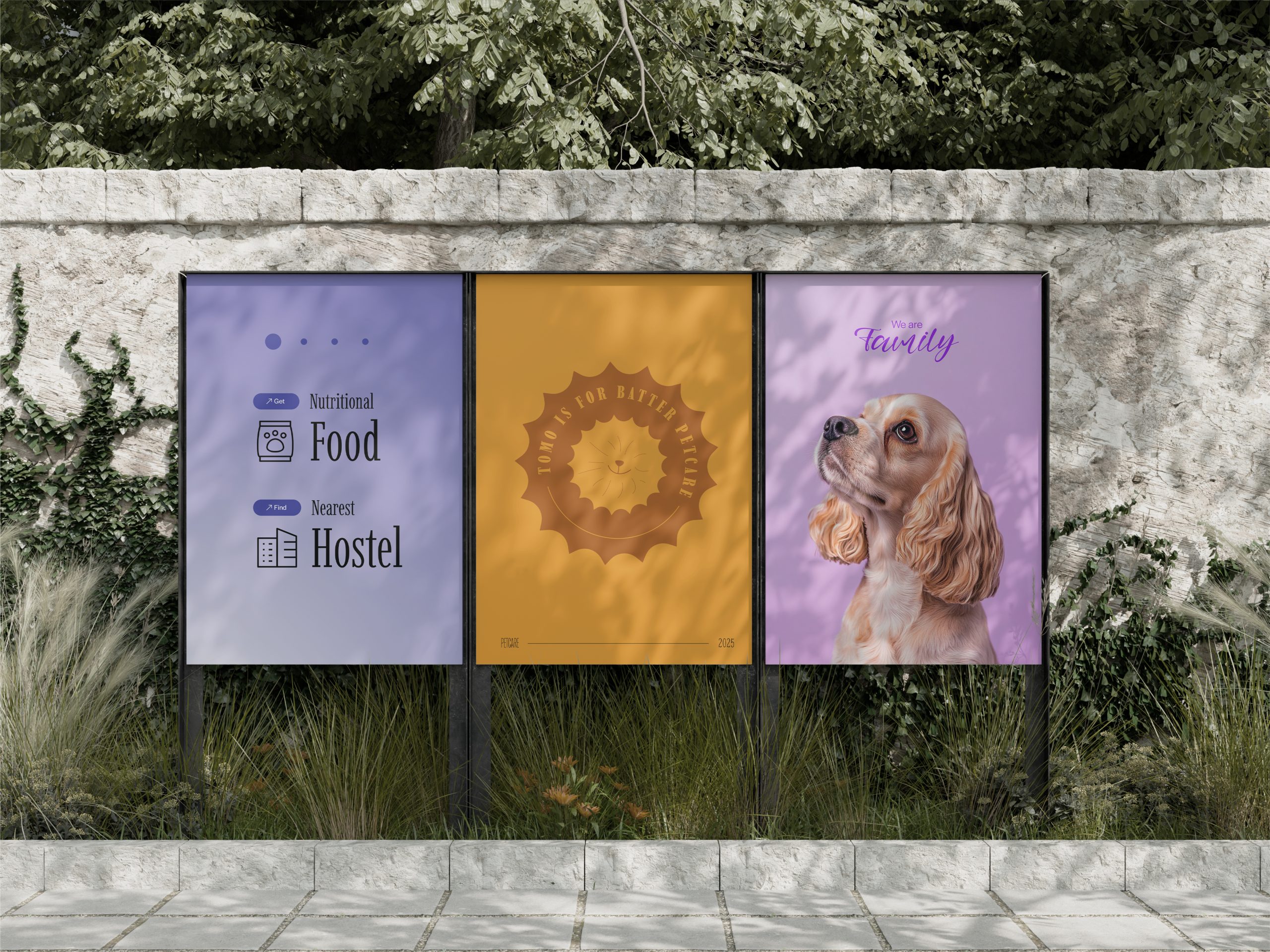
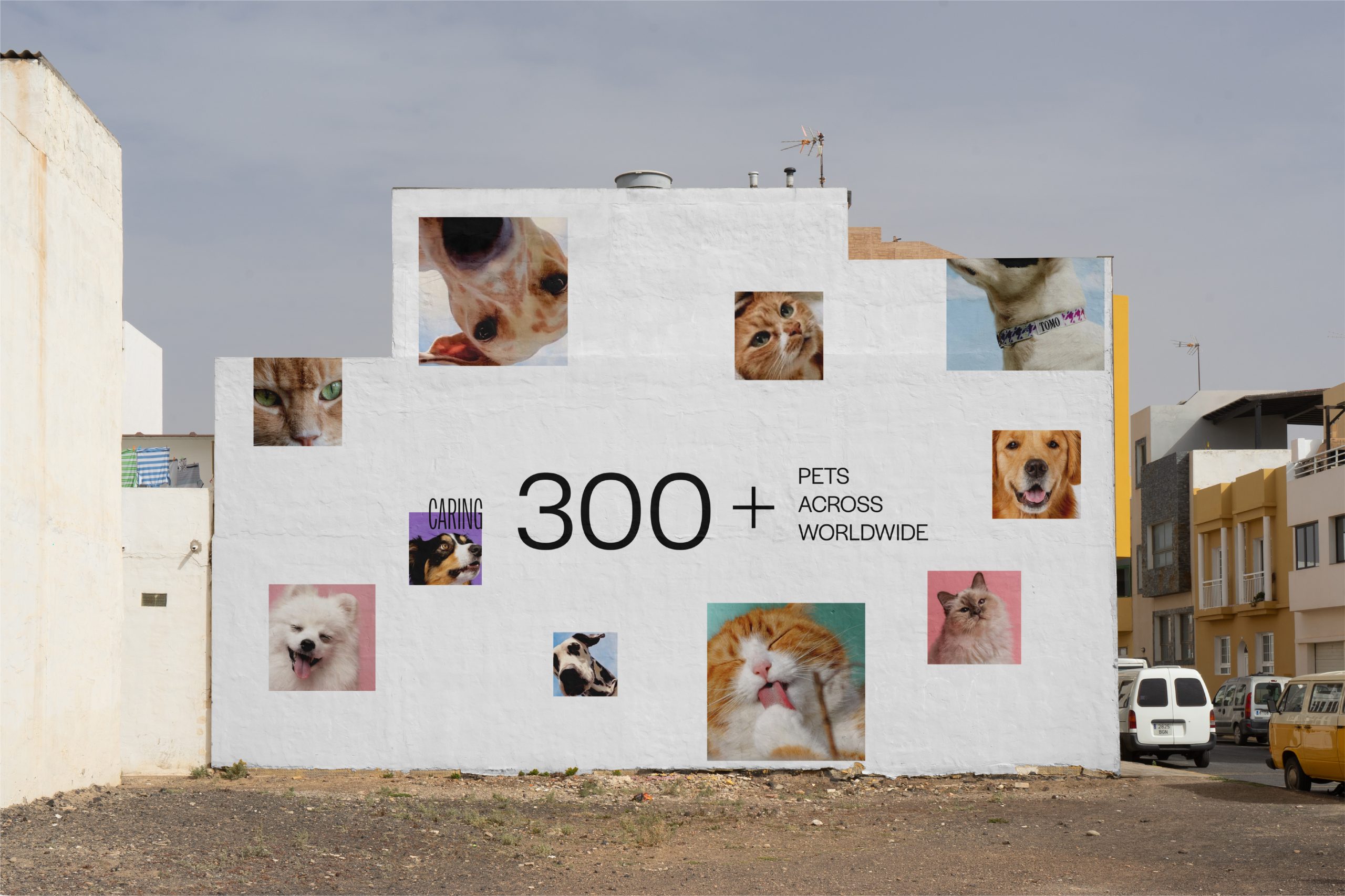
TOMO is a modern, friendly pet-care brand offering food, hostels, kits, and smart health tracking — all in one simple, trusted system

The name is inspired by the Japanese word “友 (Tomo),” meaning friend — reflecting the bond between pets and their owners.

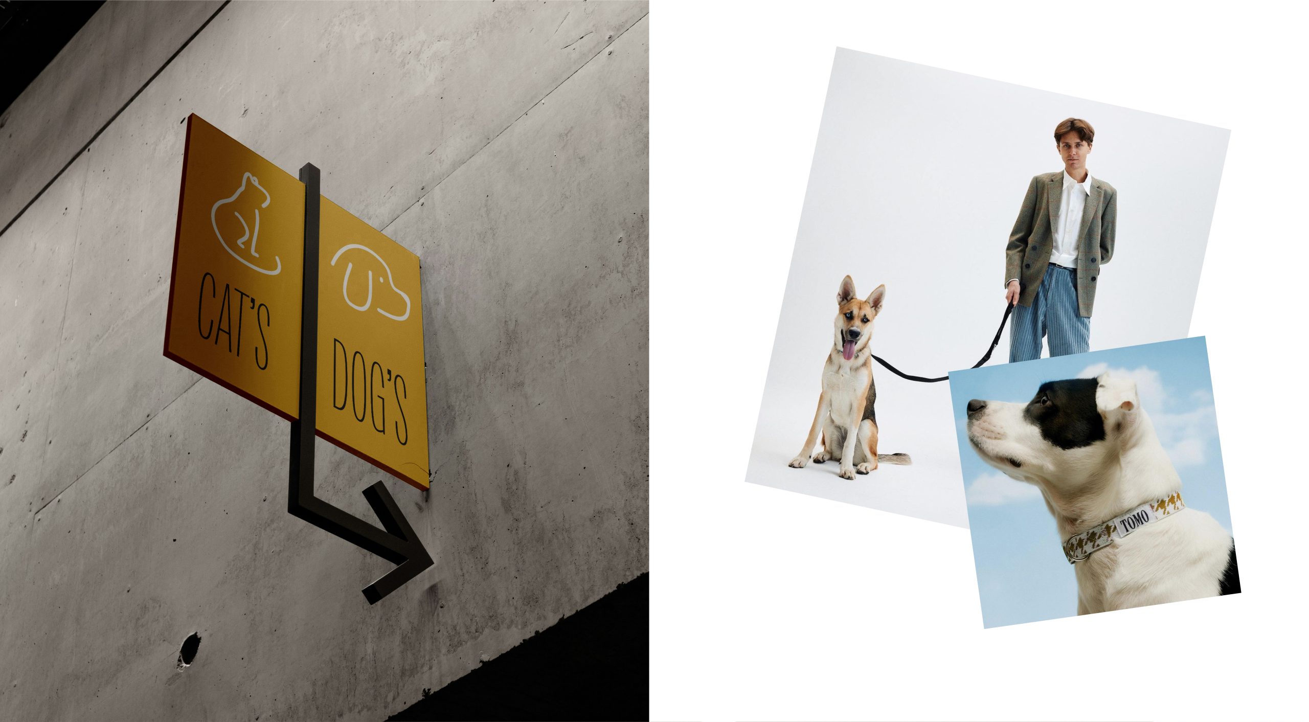
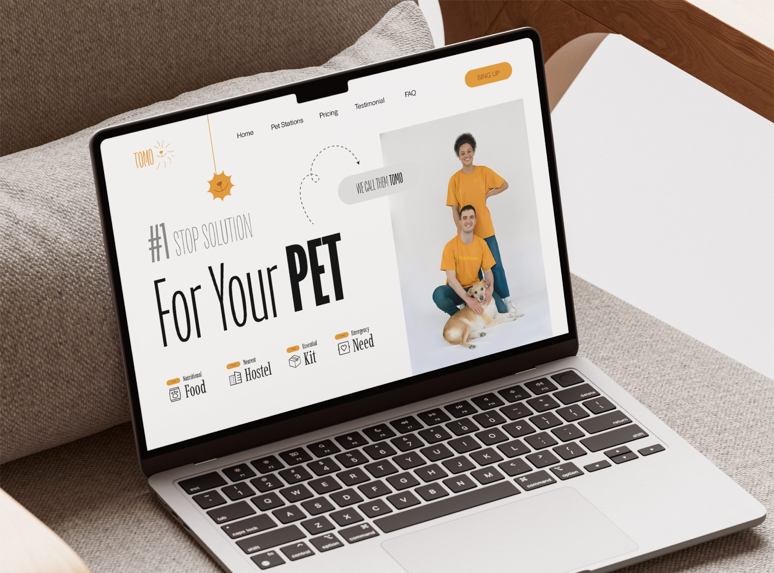
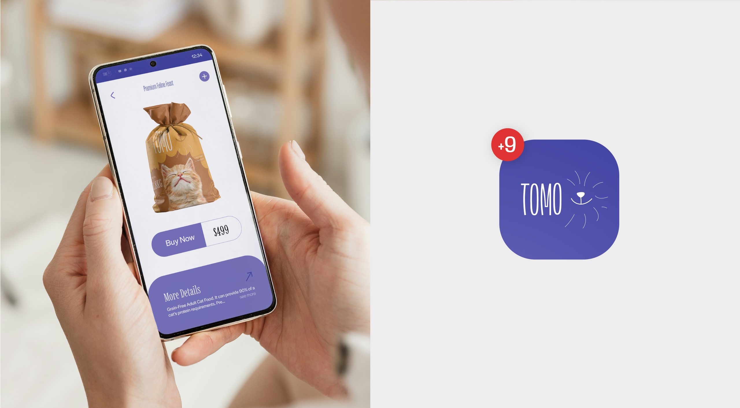
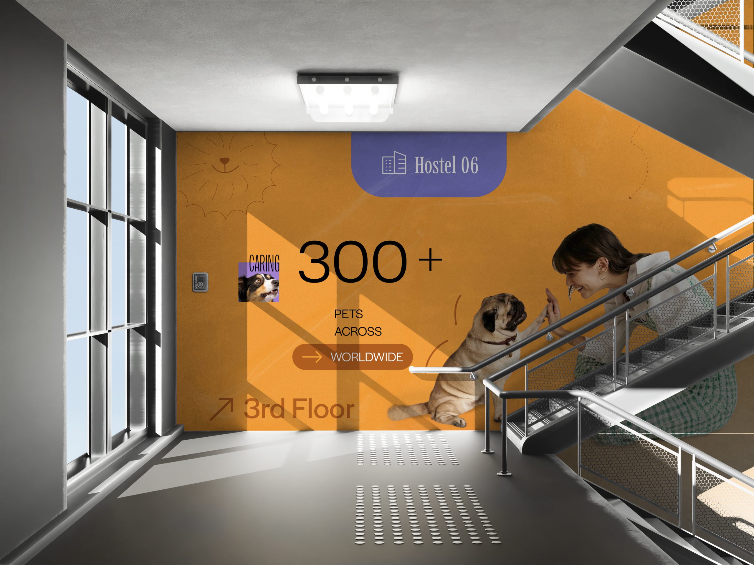
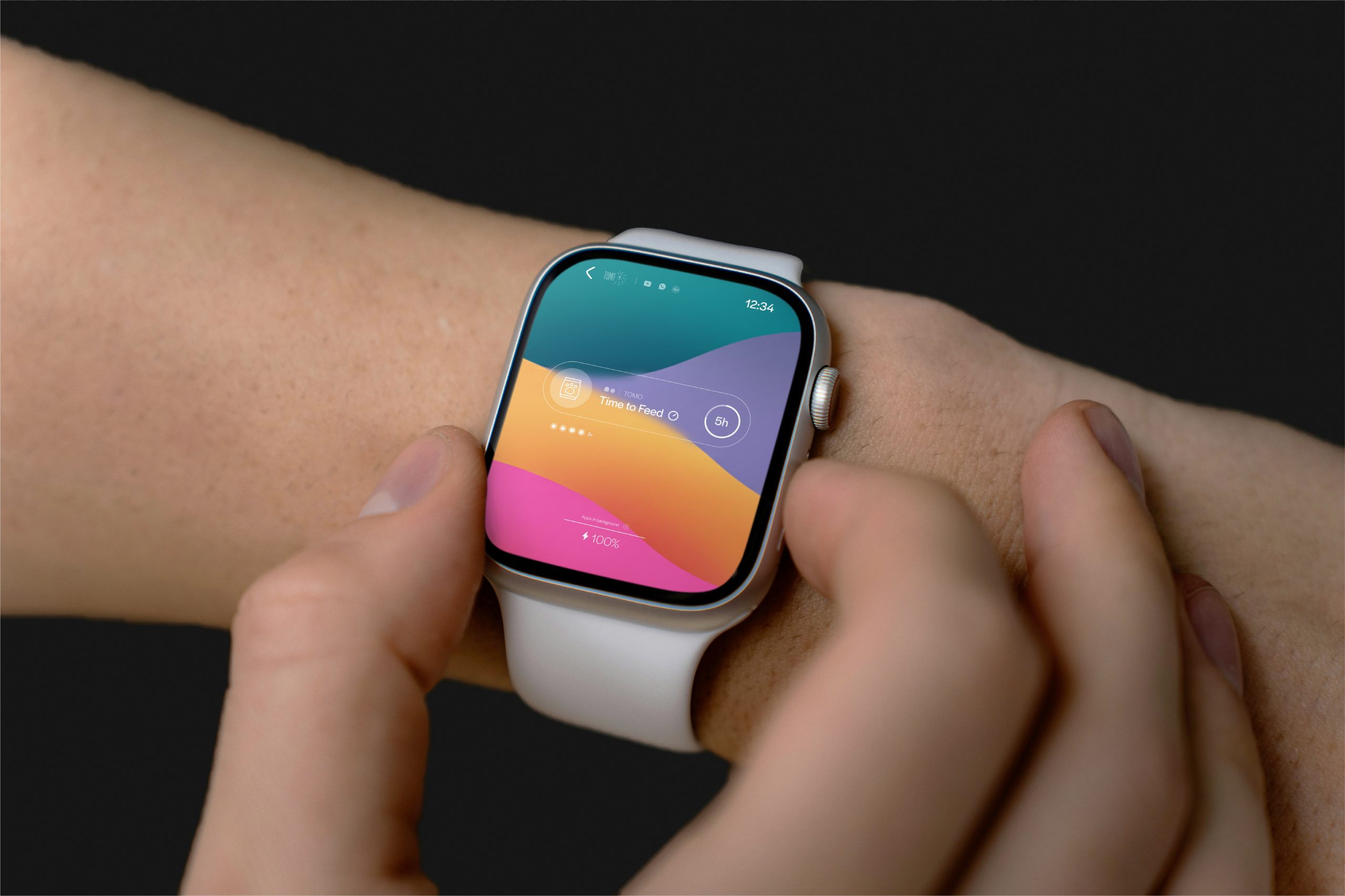
TOMO is a modern pet-care brand inspired by the Japanese word “友 (Tomo),” meaning friend — reflecting the bond between pets and their owners. Built on a vision of becoming a global one-stop solution for pet families, TOMO currently offers four essential services: nutritional pet food, safe and comfortable pet hostels, curated essential kits, and a free smart tracking system that monitors a pet’s health, activity, and daily needs through mobile and wearable devices. With this ecosystem, TOMO positions itself as a dependable, friendly, and holistic care partner for every pet owner.
 
The brand identity inspired by Japanese simplicity but designed for global appeal. Focus was on creating something friendly, modern, and functional — a visual system that communicates care, trust, and technology.

About The Logo Concept

 
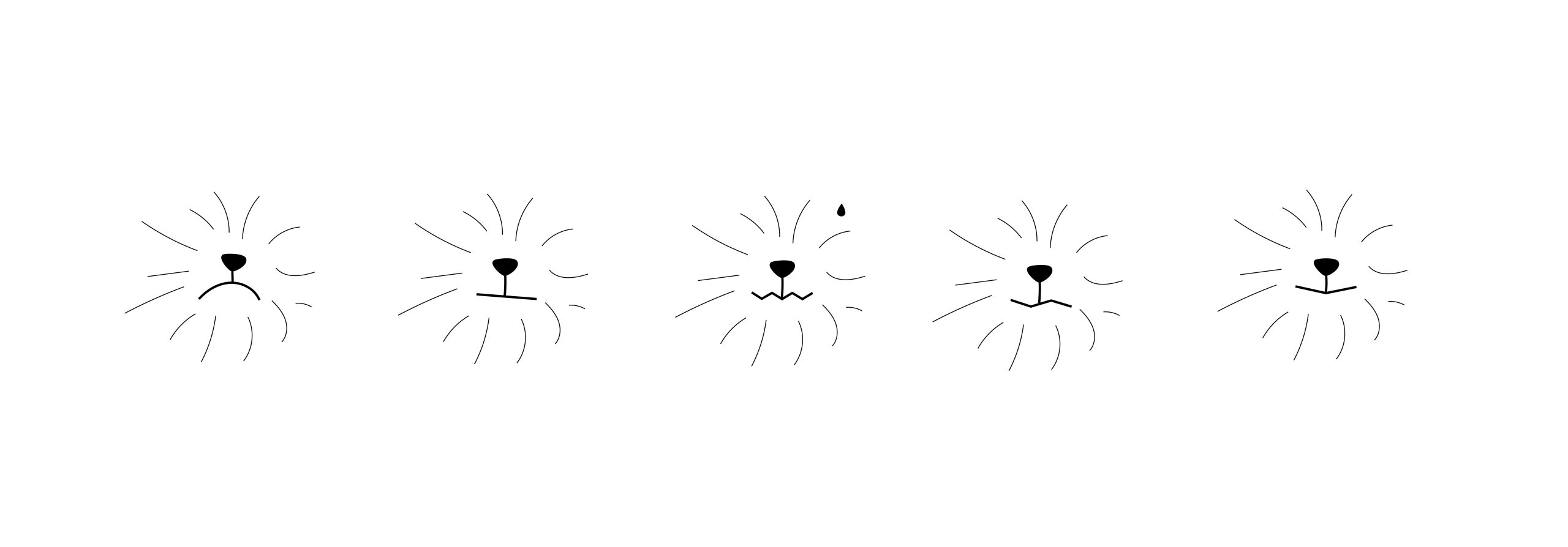
The logo concept came from the challenge of representing both dogs and cats in a single, unified symbol. Since their facial features differ, needed a shared emotion and discovered the one element they both express instantly — the nose. It’s the most iconic, universal point of recognition. By using a simplified nose shape connected with a soft, elliptical face outline, the mark captures the warmth, friendliness, and identity of both animals together. This minimal approach keeps the logo modern, scalable, and emotionally clear for every pet owner.
 
To convey different emotions, I thought a few tricks in the logo. Keeping a face, we can vary different expressions easily by changing the lip style.


Responsibilities

You have to care these things, and the rest is yours

  • Keep it simple as like the Japanese culture
  • With that simplicity, be as modern to be adoptable
  • Focus on cats and dogs only

Insights

15

Days Project Duration

2

Revisions in logo

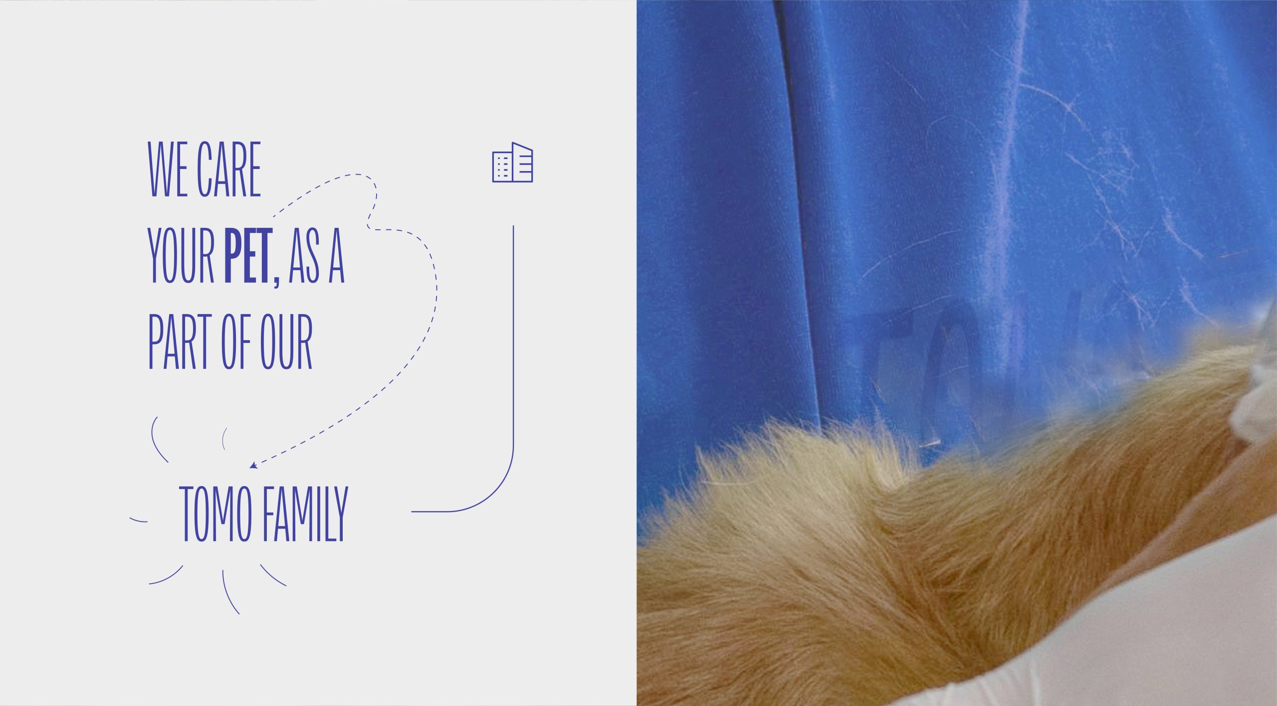
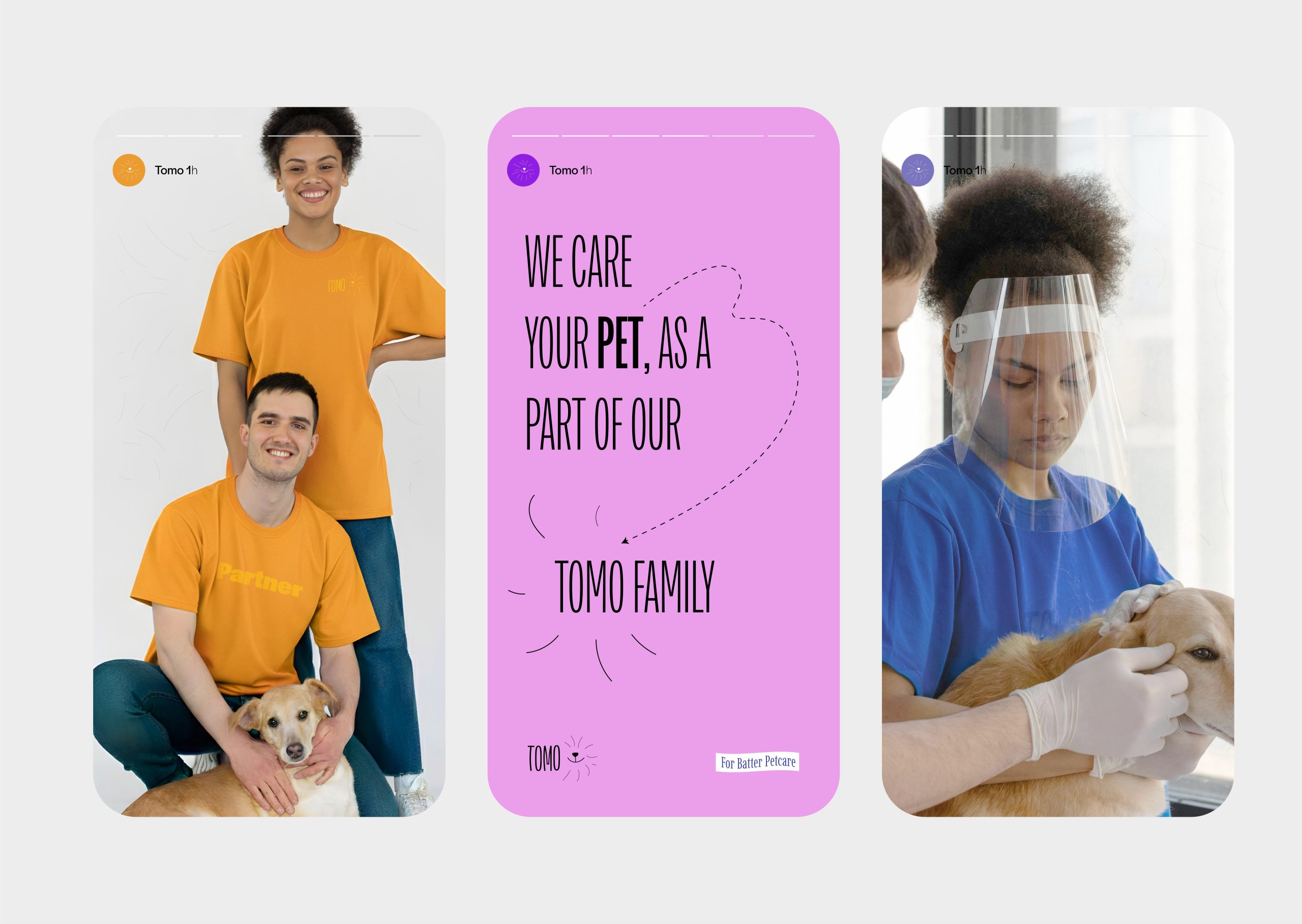
We care you, as a part of our TOMO —

FAMILY DEPENDABLE FRIENDLY HOLISTIC CARE PARTNER MODERN SIMPLICITY ADOPTABLE CULTURE
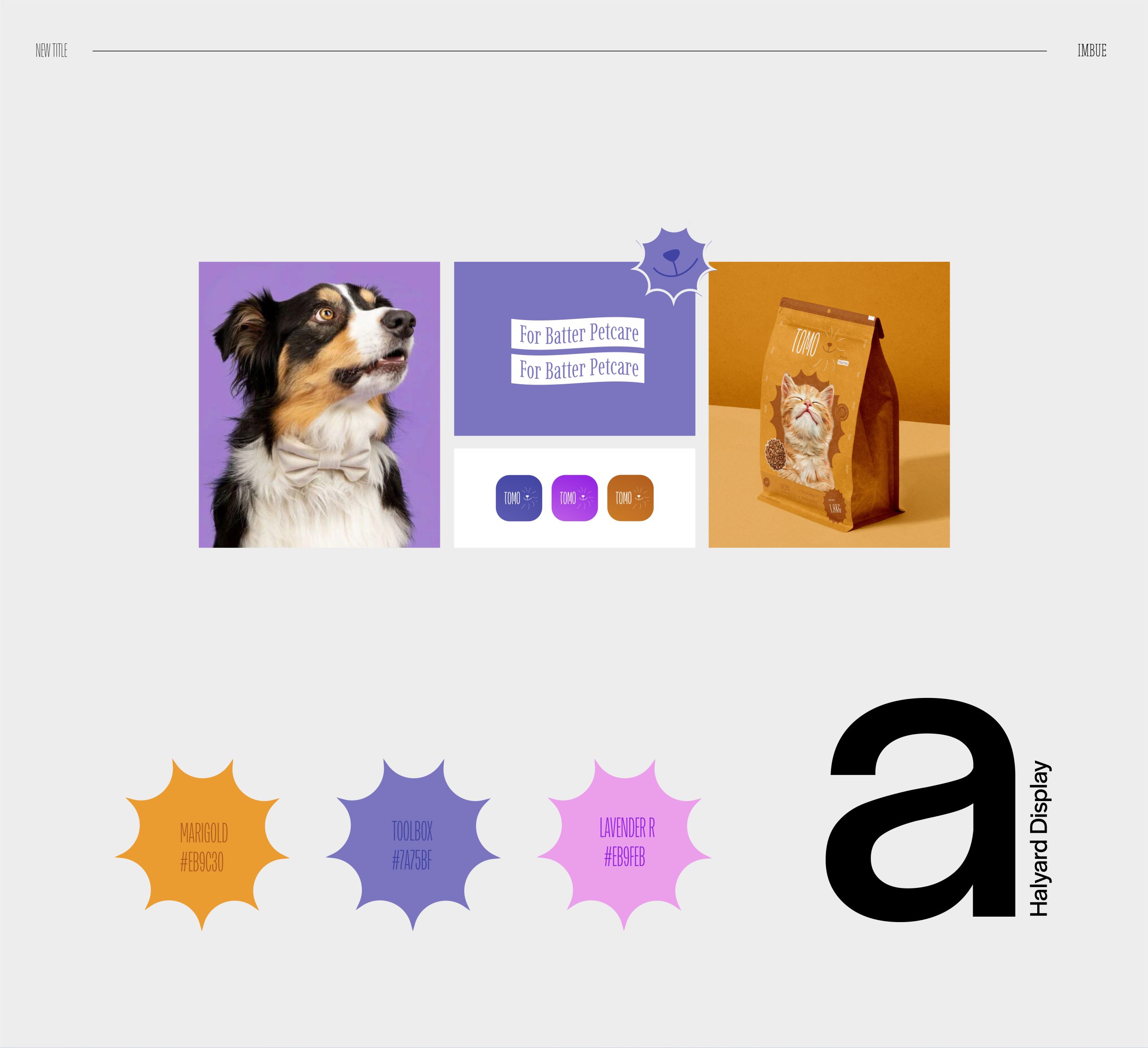
Choosing a warm color palette wasn’t that easy. We make a combo for 3 colors and one more shade above them. For the font choosing, I took the primary from the logo font and one 1more related to that size. Also need a readable font for paragraphs, so I chose ‘Halyard Display.’